
Oct 13, 2026
How to Keep Logo Color and Surface Finish Consistent Across Gift Bags, Boxes and Wrapping Paper
A sourcing guide for keeping logo color and surface finish consistent across paper gift bags, gift boxes and wrapping paper in private label packaging programs.
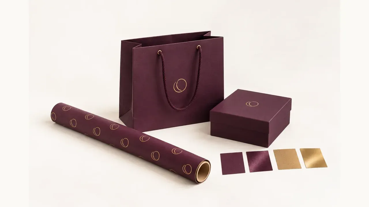
Many private label packaging projects look coordinated on screen but lose consistency in production. The logo color may appear stronger on a paper gift bag, softer on a rigid gift box and different again on wrapping paper because each product uses a different substrate, print method and finish.
For procurement teams, this is not only a design issue. It affects sample approval, brand presentation and repeat-order stability. A useful sourcing brief should explain how color and finish need to align across gift bags, gift boxes and wrapping paper before production starts.
Why one digital artwork file does not guarantee one visual result
Buyers often assume that one logo file will print the same on every product. In reality, wrapping paper, paper bags and gift boxes may use different paper surfaces, ink absorption behavior and finishing steps. A Pantone tone on white card paper may not look identical on textured wrapped paper or on a glossy wrapping paper roll.
That is why buyers should approve the intended production combination, not only the digital artwork. Consistency comes from process control, not from the file alone.
Which factors usually change logo color between products
The most common reasons for color variation include:
• different paper materials or board wrap papers
• coated versus uncoated surfaces
• matte, gloss or soft-touch lamination
• foil stamping versus printed color areas
• different factories or production windows for related items
When a packaging program includes three product types, these points should be reviewed as one system instead of as isolated sample comments.
How to define a shared color standard early
A practical way to reduce color drift is to define one approval standard before the supplier prepares all samples. Buyers should confirm whether the project will use Pantone references, printed swatches, an approved previous sample or a visual priority such as "warm gold foil with low glare" rather than only a generic design description.
It also helps to state which item is the master reference. In some projects, the gift box becomes the visual benchmark because it carries the strongest premium finish. In other projects, the bag becomes the main reference because it has the largest logo exposure at retail.
How surface finish should be planned across the full set
Surface finish is often where coordination breaks down. A matte laminated paper gift bag, a soft-touch rigid box and a glossy wrapping paper sheet can all be well made individually but still look unrelated together. Buyers should decide whether the priority is exact matching, a coordinated premium feel or a tiered product presentation.
In many cases, the best result is not identical finish on all three items. The better goal is controlled harmony. For example, the bag and box may share a matte premium look while the wrapping paper keeps a lighter finish that packs more efficiently.
What to check during sample approval
Sample review should compare all three product types side by side whenever possible. Buyers should check:
• logo tone under the same light condition
• foil or metallic effect consistency
• matte or gloss level across the set
• how color changes at folds, edges or rope attachment areas
• whether the packaging still looks unified when displayed together
This approach is more reliable than approving each sample on separate dates without a direct comparison.
How to reduce delays when one product needs a different process
Some variation is unavoidable because paper bags, gift boxes and wrapping paper are produced differently. When one item needs a different process, the buyer should ask the supplier to explain the expected visual difference in advance and propose the closest workable alternative.
That discussion is especially important when delivery is tight. Waiting until after mass production starts to discuss color difference usually creates higher risk than approving a controlled tolerance during the sample stage.
What to include in a clear packaging brief
Suppliers can manage consistency much better when the inquiry includes both technical details and brand priorities. Buyers should send:
• product list for bags, boxes and wrapping paper
• paper material or substrate preference for each item
• logo file and target color reference
• preferred finish direction for each product
• sample priority and approval deadline
• quantity by SKU and launch date
That gives the supplier enough context to recommend where exact matching is realistic and where coordinated matching is the more practical goal.
How this topic supports Google SEO and conversion intent
Content that answers a real sourcing problem is more useful for both search visibility and lead quality. Buyers searching for logo color consistency packaging or surface finish coordination are usually closer to inquiry stage than users reading broad packaging trend articles. A clear guide built around that intent can attract more qualified traffic and support quotation conversations naturally.
Quotation Checklist
• Product mix: paper gift bags, gift boxes and wrapping paper
• Logo file format and approved color reference
• Paper material or wrapped paper specification for each item
• Finish plan: matte, gloss, soft-touch, foil, embossing or spot UV
• Master sample or main visual reference product
• Quantity per SKU, size and design version
• Sample comparison method and approval deadline
• Delivery schedule, launch date and repeat-order expectation